Edition Vulfovitch
art publisher
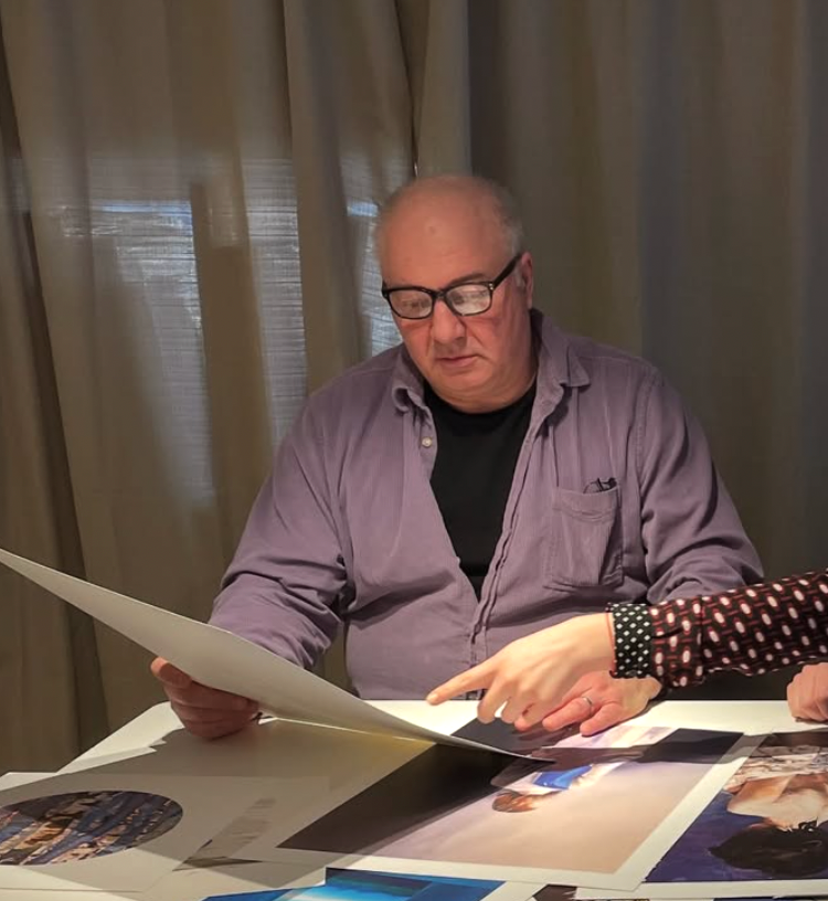
Edition Vulfovitch Art Publishing was founded in 2007 by Igor Vulfovitch and has since collaborated with leading Swedish and international artists, sculptors and photographers. Our goal is to assist our artists' establishment through exposure of their work, mediation of exhibitions and editions of high-quality original limited edition prints with a distinctive profile.
The publisher has extensive collaborations with several galleries in Sweden and Europe. We are constantly looking for knowledgeable and committed partners who share our passion and interest in the creators we represent.
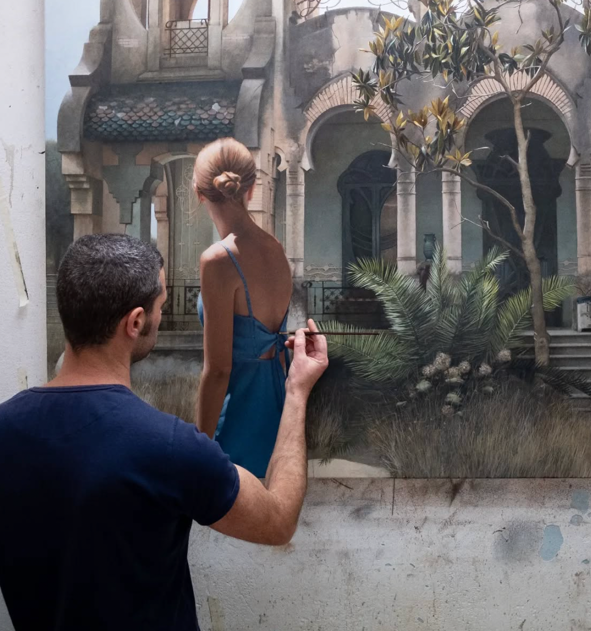
Figurative painting from Barcelona
His hyperrealistic work which often depicts anonymous people in front of some of Barcelona's most emblematic monuments, or show empty vehicles parked on the streets, have captivated both European and Asian audiences.
Figueras is a great observer, he walks the streets full of potential "models" and charming corners that inspire him. He draws sketches, photographs and transforms the movement and everyday life of the city into works of art with, despite his youth, an impeccable technique.
Educated at the Escola d'Arts i Oficis de Barcelona, he studied the art of painting glass in the workshop of the world-famous glassmaker JM Bonet and has participated in the restoration, conservation and construction of the stained glass windows in the Sagrada Familia Cathedral
-
Impression
Regular price From 4 200 SEKRegular priceUnit price per -
Reflection
Regular price From 3 200 SEKRegular priceUnit price per -
Midday sun
Regular price From 3 500 SEKRegular priceUnit price per


repetition in sequence
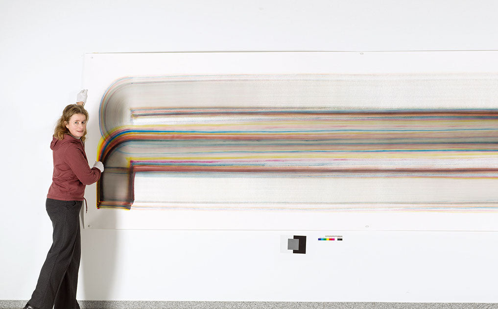
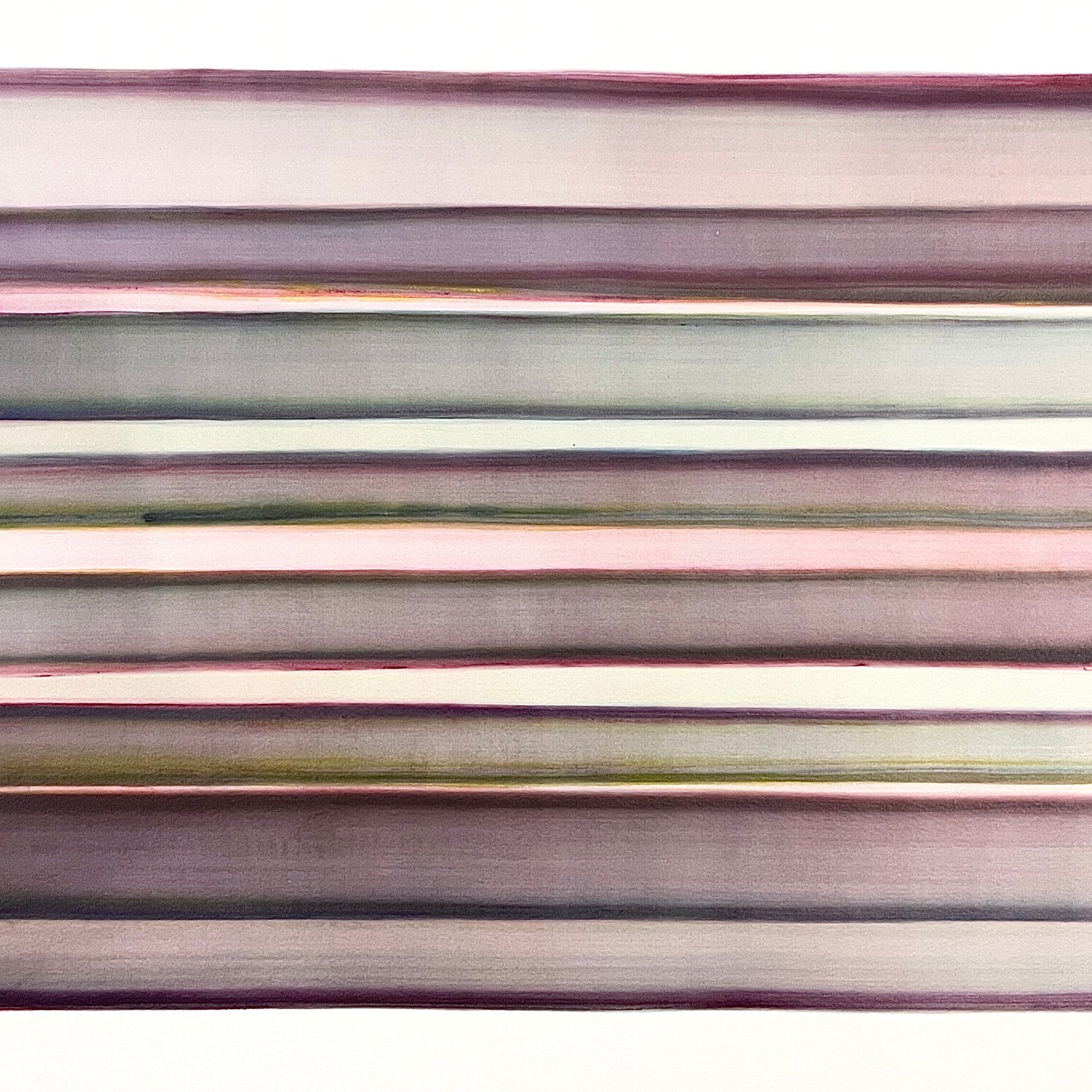
Marita Damkroger's large-format watercolours make a much more coherent impression at first glance. Here, different formal approaches are not brought together, but rather a hundred transparent, large-scale layers of colour are superimposed on each other. Unlike the usual watercolour technique, the colour does not flow into each other, but rather remains sealed in the individual layers. Their strong colours are gradually muted by the number of individual layers on top of each other. This is reminiscent of the possibilities of digital image software, with which any number of layers can be superimposed on each other and their respective transparency can be precisely programmed.


Precision in stock
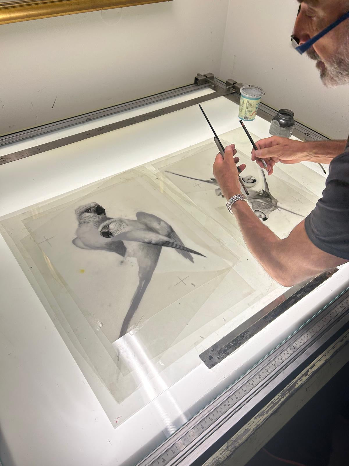
'The medium of lithography is very different from painting, mainly because of the meticulous way in which the colours have to be treated. With watercolour I can work with several colours at the same time and let them mix already in the brushstrokes, which gives rise to surprising results. I often find that the paintings, in many ways, "paint themselves" and the result is also almost immediate.
For a lithograph image, I have to plan every little color shift before it is printed, to slowly and deliberately build up a harmony between all the colors - often the image will go through the printing press ten to twelve times and sometimes more before all the shades and transitions interact.'
Karl Mårtens, from 'When intuition takes control' - a book about the lithographic process.


PIGMENTS CONTROL
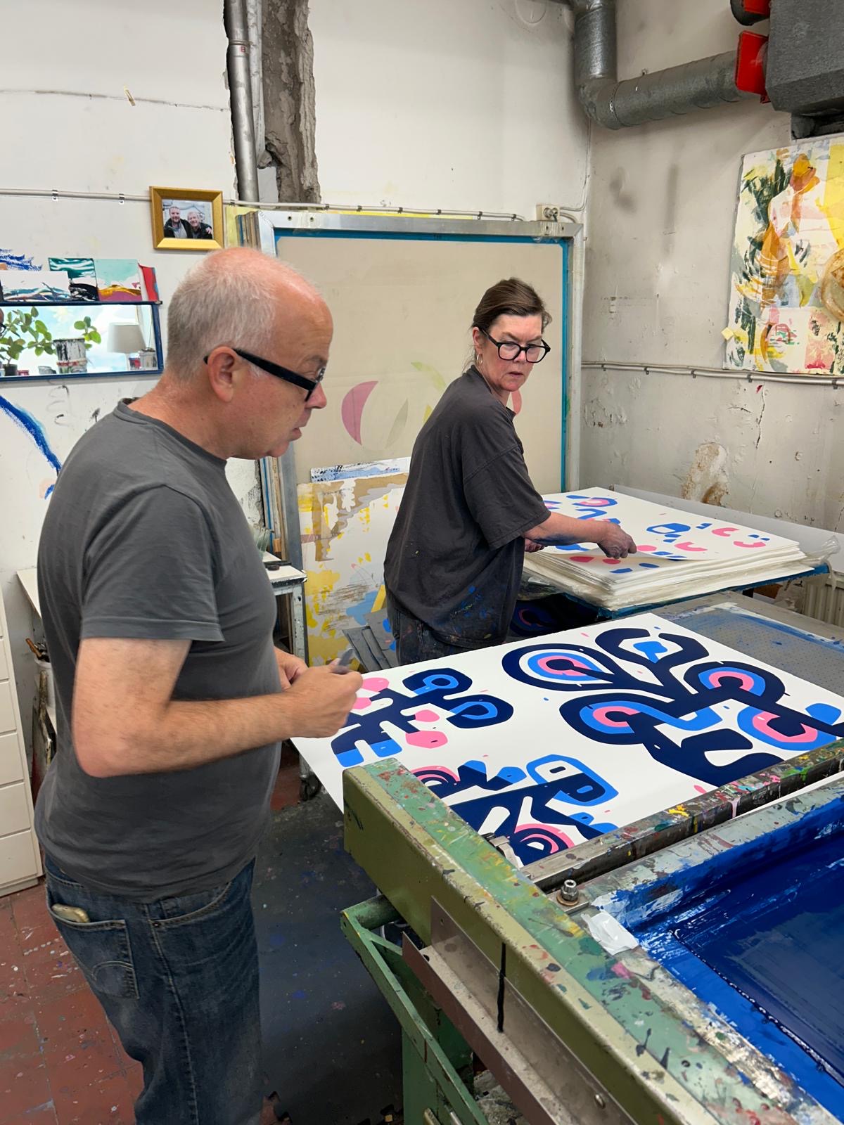
The latest series presented in the exhibition LASSE SKARBÖVIK at the gallery was created by Catarina Landberg at Atelier Landberg, who for generations has specialized in the technique of screen printing; a technique that grew in popularity after Andy Warhol.
Together with the publisher, the new series consisting of 3 motifs has been printed both on white paper and on Somerset Velvet Black, and the same motif has then been given a completely different expression.
Six smaller-format motifs have also been created using the Digital Screen Printing technique.


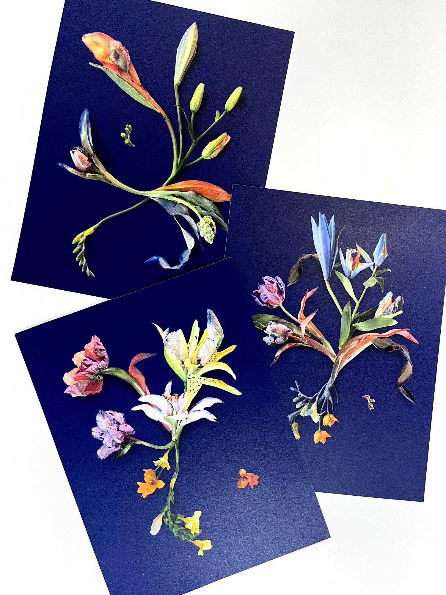
Passage
The new graphic series Passage consists of three motifs; Root, Growth and Vigor. These depict the hybrids' journey from birth to full bloom. Root symbolizes birth, and the motif also pays homage to Botticelli's 'Birth of Venus'. Growth is a depiction of youth; finding one's voice, getting to know oneself and discovering the world, and in Vigor the artist wants to show the strength of perfection.


